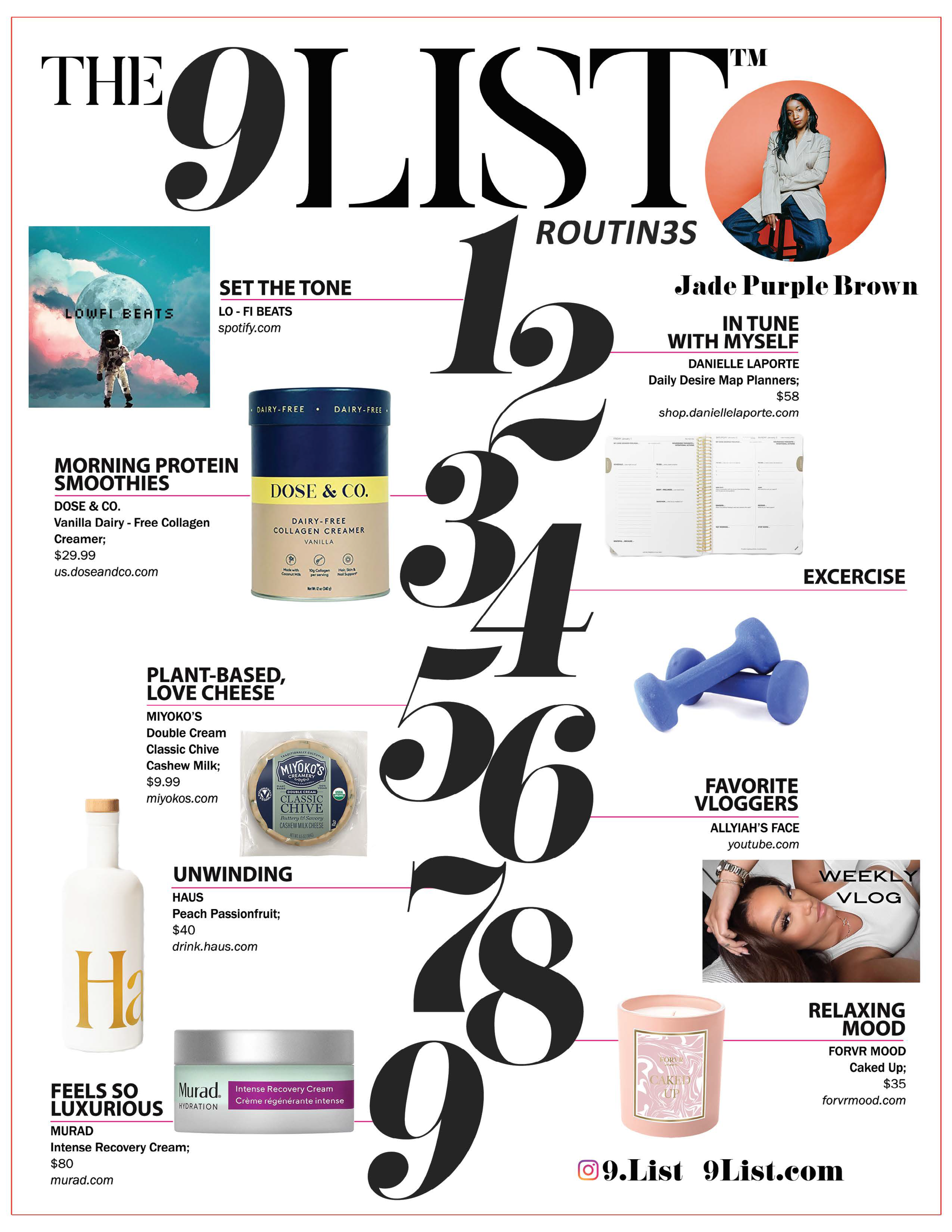
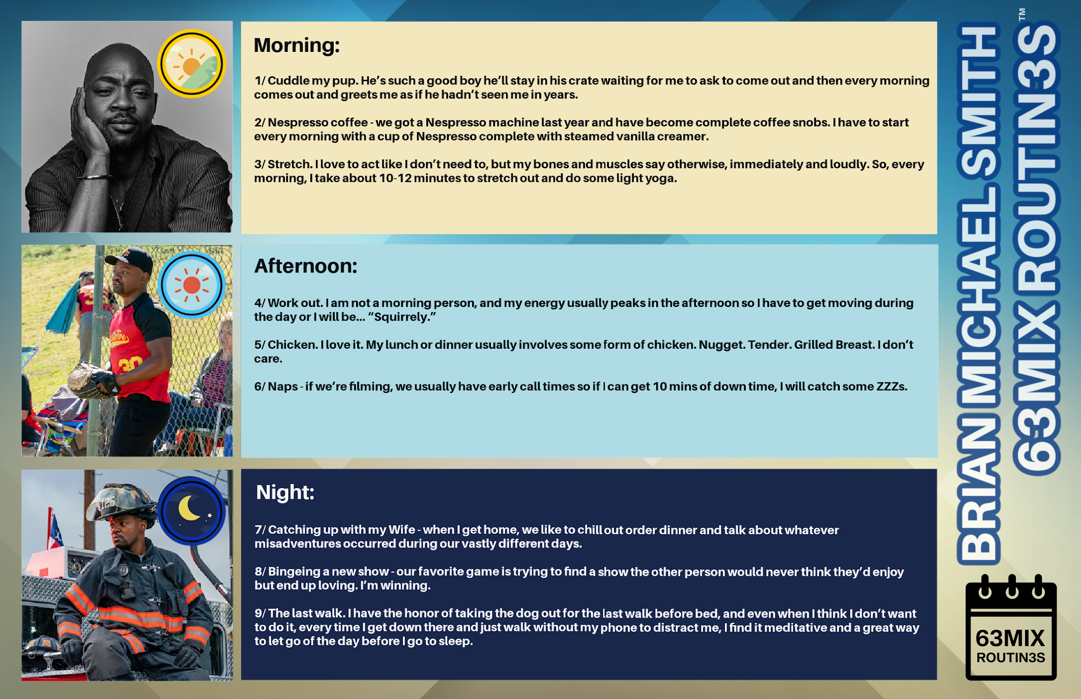
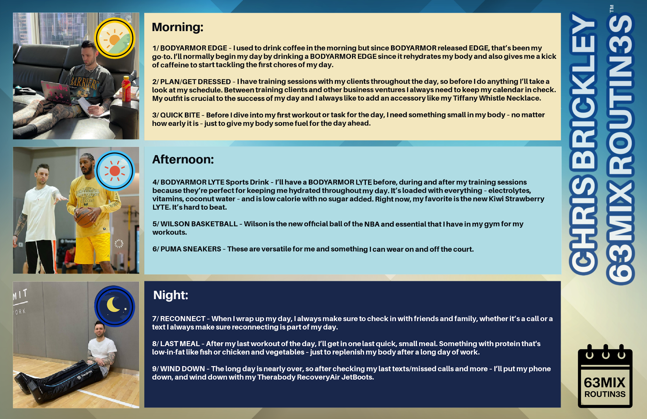
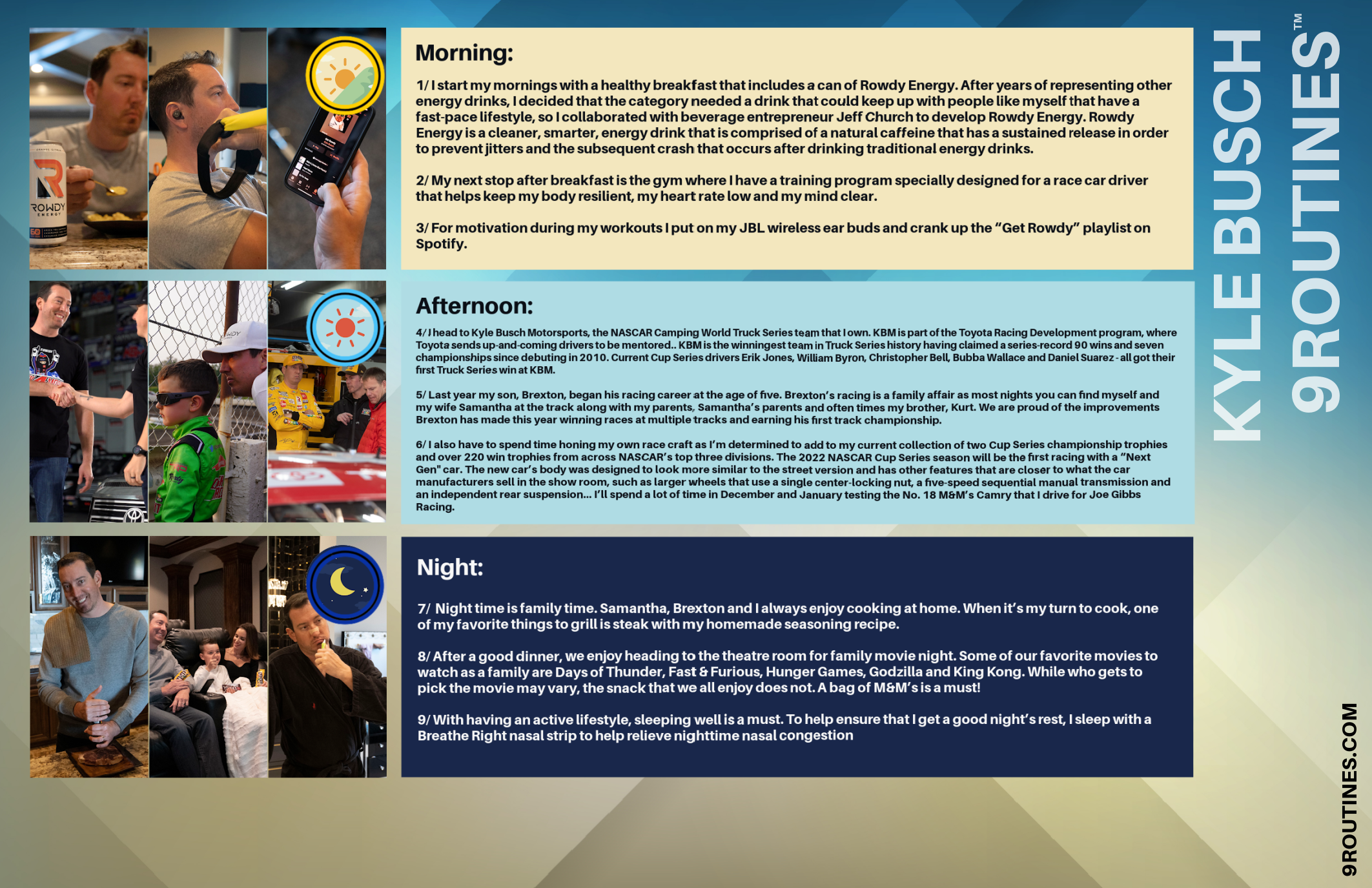
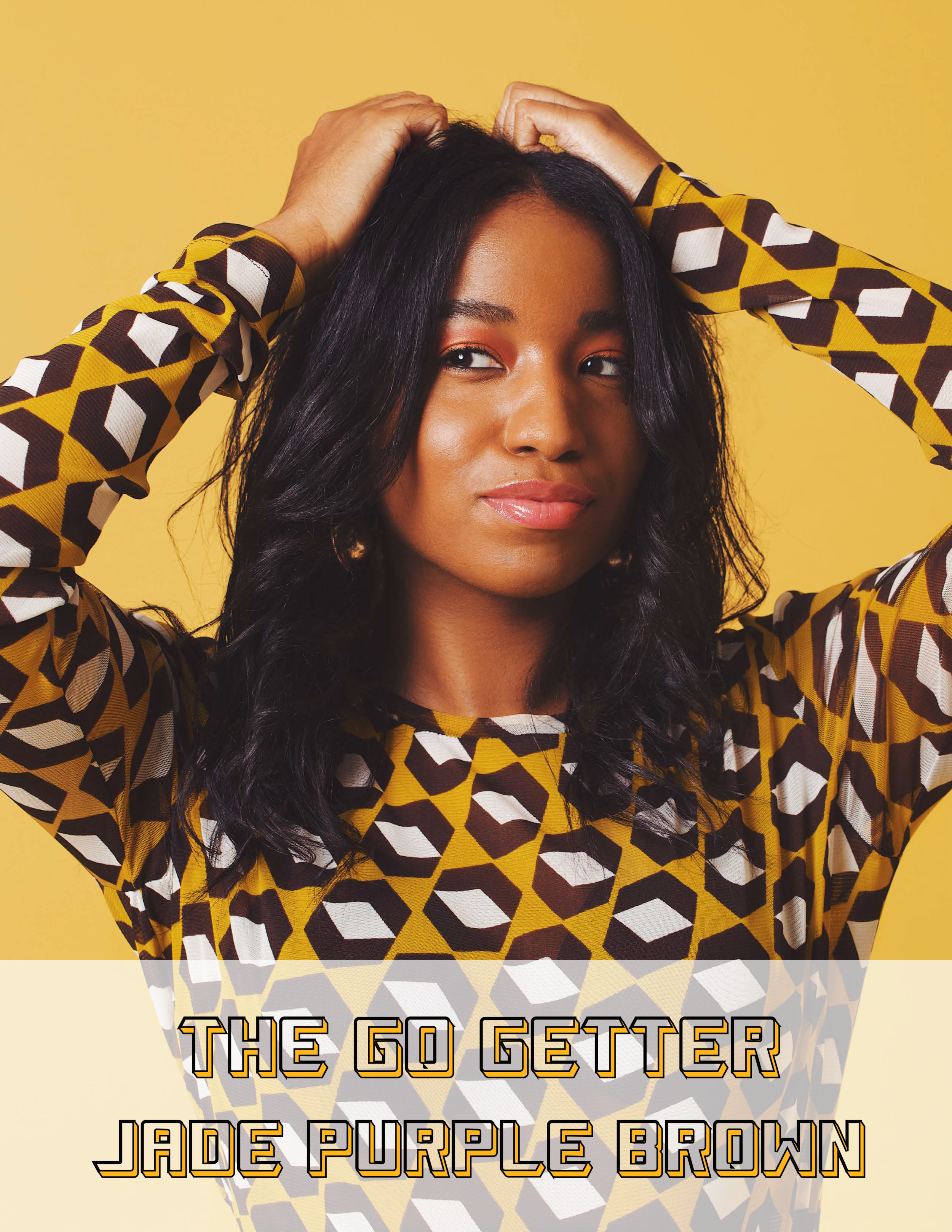
We've been a fan of the art created by Jade Purple Brown who is known for her pops of color! You've seen her work with clients that have included Drew Barrymore's Flower, EOS, Murad; a splash page for Adobe Illustrator, images that have included iconic pictures of Diana Ross and Beyoncé, or whether it's been her creativity when it comes to showcasing strong women in a 60's and 70's style! We took some time to talk about her portfolio, process and how she got into the industry.
ATHLEISURE MAG: When did you realize that you wanted to be an artist?
JADE PURPLE BROWN: In college, I studied Fashion Marketing & Management because I originally wanted to pursue a career in fashion styling. I knew that gaining a strong business background would be great for me and help further support my career. While I was in the program they taught us the basics of Adobe Photoshop, Illustrator & InDesign to create marketing materials and I quickly fell in love. With the help of online tutorials, I started using the programs on my own time to create unique designs. From there, I slowly started to figure out that my true passion was art and design and that I had a natural talent for it.
AM: As an artist, how do you get inspired to create your work?
JPB: Strong go-getting woman, 60s and 70s Interior Design, Bold fashions, and the Black community as a whole, constantly inspires my work. These themes always pop into my brain as I sketch out new pieces or begin planning my next moves. I also find that a clean organized workspace and good music really keep my ideas flowing.
AM: As an entrepreneur, how do you balance between creating pieces that align with your vision, commissioned pieces, and doing the day-to-day business of elevating your brand and goals?
JPB: All of the clients that I choose to work with come to me specifically for my style, which is amazing because it better ensures that my overall vision will stay intact. However, I do challenge myself on an ongoing basis to create personal work so I always feel like I’m growing and experimenting within my work. Most clients reach out because they’re drawn to my self-initiated projects, so taking the time to challenge myself and create freely helps with gaining new client work as well.
AM: You have worked with a number of brands from Sephora, TikTok, Drew Barrymore’s Flower Beauty etc – as an entrepreneur, what’s your process when it comes to onboarding projects. Do you look at synergies that exist between you?
JPB: Before accepting new projects I always make sure that the brief really champions my artistic voice and make sure that it would be a project that I would be proud to include in my portfolio. My agent also makes sure we’re all aligned on deliverables, timeline, and budget to make sure that everything goes smoothly.
AM: Your work centers on positivity, individuality, and what it means to be a female artist/woman of color – how do these themes and messages manifest themselves in your work?
JPB: The overall theme of all my work is joy. I want people to feel good when they see my work. A lot of my work features characters who are Black and people of color — something that I didn’t see a lot of in art and design growing up. I want people to be able to see themselves in my work and feel good about who they are and optimistic about the many possibilities of life.
AM: Are there color palettes that you tend to incorporate into your work and if so, why do you lean towards those?
JPB: Color can evoke so many different emotions. For me, I want to evoke freedom and fun, so I use a lot of punchy colors, and then I’ll also balance them out with more neutrals, browns, blacks, and whites. Juicy, mouthwatering colors like red, orange, pink, and yellow are my go-to's.
AM: Your work has been on prints and recently on throw blankets, although they are currently sold out will you bring these back or have future products like this available?
JPB: It’s been really fun to create bold contemporary art prints + thoughtful art-centered products that aim to add a post of joy to everyday life. A new throw blanket design will be coming out this winter, and I’ll be launching Beach towels this summer.
AM: Currently, you partnered with Murad which launched their Intense Recovery Cream which assists stressed-out skin. You created artwork that we can download to color to continue feeling calm – can you tell me more about this image?
JPB: We all need to stress less these days which is why I’ve partnered with Murad to create an art piece that evokes a sense of calm as you color your way through the sheet’s white spaces. The illustration pulls inspiration from Murad’s newest innovation, Intense Recovery Cream – a dose of calm for your face, and is outlined in Murad's signature black cherry shade. The shapes are filled with soft yellows, blues, and purples, while relaxing nature elements along with the words "Peace" and "Love" are illustrated in hopes of relieving daily stress
IG @JadePurpleBrown
PHOTOS COURTESY | Jade Purple Brown
